The original concept sketch from the designer of the new Daleks :
 If you look closely at the concept sketch you can see that the original redesign looks both very similar and very different to what got built.
The concept looks more like a Dalek-as-we-know-it with extra casing elements, an all-in-one bumper/skirt extending up the back of the Dalek and linking to the shoulder section. The domed panels seem to be raised, more like armour. The back “vent” looks to encase the machine beneath, not be integral to the body itself – and so on. Overall the geometry is still “Dalek”, most crucially there is no actual hump-back, just extra armour around the midsection.
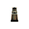
It’s a shame that what we actually got was this :


I can’t help but feel that if the props had been built exactly as per the design sketch we’d have got some not unreasonable new Daleks. Not everybody would have liked them….
BUT…. at least they would have looked like “real” Daleks….


 Dalek 2nd Empire online comic by Mechmaster (fantastic!)
 Download "I'm Gonna Spend My Christmas With A Dalek" (1964) by The GoGos (mp3)
 Download a free Dalek "To Victory" poster (pdf)
 Download a free Dalek font
 Exdrawminate
 The Daily Dalek
 War of the Daleks miniatures game
 An Evil Giraffe – Dr Who & other miniatures blog (great paintwork!)
 Crooked Dice – makers of the Doctor Who Miniatures Game & other stuff
 Harold Saxon's Website – Vote Saxon!
 Society of Fantasy and Science Fiction Wargamers
 U.N.I.T.


I totally concur. The new Dalek design makes them look like they have bustles. Completely ridiculous and very plastic looking.
I cannot help but agree that the new daleks look ridiculous. I grew up with the daleks and watched them evolve from the fairly helpless metal floor bound creatures to homicidal galaxy wide marauders and enjoyed every incarnation and variation. They used to be sinister but I think they now look more like plastic bubble bath holders than the most feared warriors in the cosmos.